
Here’s an interesting thing that I came across when evaluating a mailing for a client that I need to share.
The observation
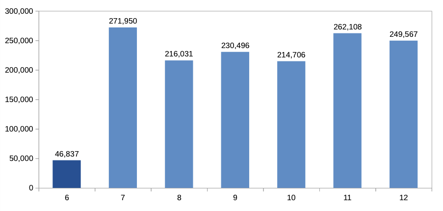
So what we’re looking at here is the revenue for a given group of customers from 06/2014 to 12/2014. (Note that the data presented here is completely fictional recreated in a spreadsheet, but follows patterns similar to the original data. See below for more details.)
This group of customers had been selected due to its inactivity as defined by the revenue in 06/2014 being smaller then a certain threshold (again, the actual selection was a lot more refined that is described in this model).
The mailing was sent out on 01/07/2014 to the group of customers. So we’re looking at a total revenue of $46,837 in 06/2014 and a subsequent jump in revenue to $271,950 in 07/2014.
At first sight, that seems to be great news – the mailing worked, revenue increased drastically, everything fine.
However, when I looked at preceding months, the following pattern emerged:
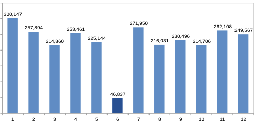
So our group of customers had a high revenue 01/2014 – 05/2014. Then in 06/2014 – the month that was used to determine whether or not a customer was active – the revenue suddenly drops by about 80%, only to be back at the original level the following months.
Now this seems rather odd. In fact, it looks a lot like there’s something wrong with the analysis.
But as it turns out, it’s actually perfectly correct. What we’re observing is due to what I call the selection bias.
So what’s going on there? How can such a weird pattern emerge if not due to a faulty analysis?
Patterns in the data
The key to understanding how this patterns emerges is in understanding the patterns in the underlying data.
When I took a close look at the raw data, I realised that the revenue followed a certain pattern: Most customers would have quite a low base-line of revenue every month. But every now and then, there would be a huge spike (a large purchase) that was many times higher than the base-line.
When you think about it, this is a usage pattern that’s quite common. Consider the following cases:
- A computer retailer, where customers buy an expensive laptop or a tablet every now and then, and cheap accessory (mice, cables, adapters, usb sticks,…) more often
- An airline, where customers buy an expensive ticket three times a year
- A travel agent, where customers book holidays twice a year
The list could go on and on, but what you can see is that the pattern of a low baseline and huges spikes a few times a year is perfectly reasonable and common.
Creating dummy data
For the purpose of this article, I created dummy data with a similar pattern. The dummy data set contains revenue for 1,000 users and 12 months, and is designed as follows:
- each user has eleven low-revenue periods and one high-revenue period
- in the low-revenue periods the revenue is a random number between $0 and $100
- in the high-revenue period the revenue is a random number between $1,000 and $4,000
This is what that data looks like:
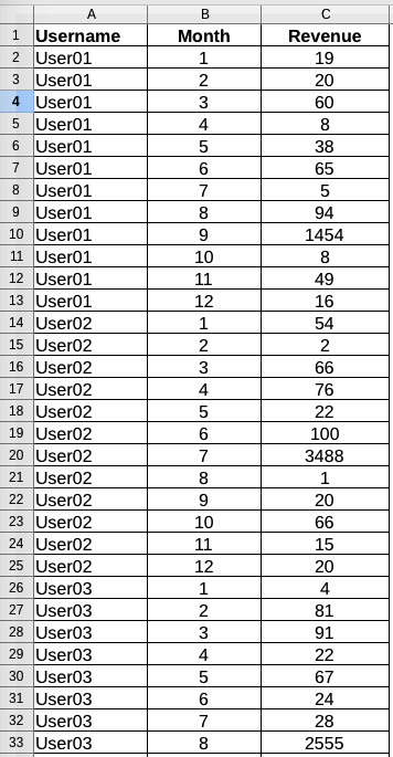
So what we’re seeing here is an excerpt of the revenue data per user and month. The three users depicted have a low baseline revenue below $100, but once in a while the revenue shoots up to a number 10-20 times that high (e.g., for User01 to $1,454 in period 9) – which is exactly what I had observed in the original data.
How the patterns lead to the results observed
If I then select my low-activity users as “revenue < $100 in 06/2014”, and plot the revenue per month, the pattern seen above emerges.
The reason is, that, given the purchase pattern described above, if the user base is large enough there will be customers that match whatever pattern I choose.
In my example above, there just happened to be 918 customers that had a revenue smaller than $100 in 06/2014, and 82 customers that happened to have had a larger revenue.
But here’s the thing: Those customers were in no way different than the other customers. They followed the same patterns, had the same average revenue, the same total revenue. They just happened to have a low revenue in the months that was chosen for the selection criterion.
Take home message
So we see that as soon as there are activity patterns as outlined above, selecting users by activity becomes a tricky business. At the beginning of this article we said that the purpose of the mailing was to stimulate customer activity. As we can see, it has become almost impossible to distinguish between the effect of the selection and the effect of the mailing.
So what can we take home from this? Well, there’s a couple of things:
1. Always use control groups if possible. Comparing usage against a control groups rather than comparing the same group over time avoids seasonality and any other effects that you may not be aware of.
2. As opposed to looking at total revenue per month, looking at median revenue may be better for your analysis. But this depends a lot on how your data looks like.
3. Be smart about how you define an active/ inactive user. Generally, the longer the period the better. But more importantly, it depends on your business and user base what length of time works best for you. Put differently, a user that doesn’t buy anything for 6 month is not necessarily inactive, but may follow a perfectly normal purchase pattern.