Marketers frequently face a situation like this: In a survey it is found that 57% of women prefer product A, while 60% of men prefer product B.
In this article I will show how marketers – using only simple statistical analysis tools available in Microsoft Excel – can quickly and easily decide whether or not they can draw meaningful conclusions from such a result, or whether they may be making fatal mistakes by interpreting random noise as valid data.
Marketers frequently face a situation like this: In a survey it is found that 57% of women prefer product A, while 60% of men prefer product B.
Some marketers will just go “Great, statistics prove that women prefer product A, and men prefer product B. We’ll market product A to women then and product B to men.”.
But is this really always a valid conclusion? Couldn’t it also be that the difference is purely coincidental? After all, we haven’t asked all people, but only a subset of people: those participating in our survey. So maybe if we took another sample, and asked different people, the results would be different? May well be!
Statistics to the rescue!
As is often the case, statistics can provide a solution. Before delving into the details, let’s look at another, more formalized example. Dice!
Suppose we take two dice, and we want to know if one of them is loaded, i.e., we want to know if one of the dice yields better values than the other. Let’s start by throwing them 10 times each. This is what the results may look like:
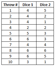
Well. What do we get? Let’s look at the mean value for each die. As a reminder, if the two dice were fair dice, there would be an equal likelihood of one in six for each number to turn up. More formally, the expected value would be 3.5 (=1/6*1+1/6*2+…+1/6*6).
So what do we get for our dice? For die 1, the mean is (4+4+4+…+3)/10 = 4.40, the mean for die 2 is (5+2+1+…+1)/10 = 3.20.
So is die 1 better than die 2? Well the average is higher, of course, but as you will intuitively suspect, 10 throws is quite a small number of throws to draw any meaningful conclusions.
The more the better
So let’s throw the dice a couple more times. When I did this (I simulated 100 throws in Excel using the random-function), here’s what I got:
For die 1 the mean was 3,80, for die 2 the mean was 3,27. Hmm. Closer to the expected value of 3.5. Still though the question remains: Is the data we now have enough to say that the dice are not loaded? Or is the difference still just due to random ‘noise’?
Let’s take a look at the average values if we throw the dice a couple of times more:
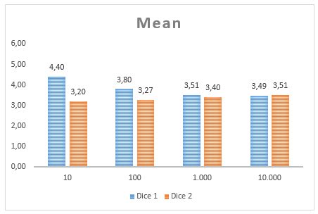
What we see in this graph is the mean value for the two dice at 10 throws, 100 throws (we looked at those values above), 1.000 throws and 10.000 throws. We get a good feeling that the more often we throw the dice, the closer we get to the expected mean. However, we also see that even at 1,000 throws the average for dice 2 is at 3.4, i.e., off by 0.1.
So when can we ‘believe’ what we’re measuring?
As mentioned above, statistics can help us – the keyword we’re looking for here is statistical significance. A difference between two groups is called significant, if the probability that a given outcome occurs by chance alone is below a certain threshold. That threshold is, as convention has it, set to 5%.
So what we’re saying is: We can’t be 100% sure that the results are not influenced by chance. However, we can estimate how likely it is that the results that we observe occur if the dice are fair.
Using Excel to analyse significance
I won’t go into all the nitty gritty statistical details, but instead show you how to use Excel to answer our questions.
So what you do is go to the Data-tab in Excel, then click on Data Analysis in the Analysis section (as shown here) and select “t-test: Two-Sample Assuming Unequal Variances” (Note: You will need to activate the “Analysis ToolPak”, which comes with Excel, but is deactivated by default. Here’s how). You should see the following screen:
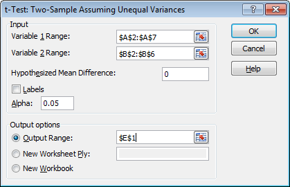
You now just have to select the ranges for your dice (“Variable Range”; tick the “Labels” box if you include your headers in the range), and set the “Hypothesized Mean Difference” to 0. Keep the Alpha at 0.05 (that’s 5% error threshold mentioned above). When you click “OK” you should get something like this:

So that table holds the answers to all our questions, albeit in a quite cryptical way. Let’s break it down (we’ll skip the greyed-out metrics). First there’s some descriptive information about your data:
- Mean: The mean of our selected observations, as discussed above, 4.40 for die 1 and 3.20 for die 2
- Variance: The statistical variance of your observations, measures how far a set of numbers is spread out. Not that important right now.
- Observations: How many observations are we looking at? 10 throws, in this case.
- Hypothesized Mean difference: We’re assuming that the two dice are similar (this is what we’re trying to find evidence for or against), so we hypothesize a mean difference of 0.
Now there’s the three core values of our t-test that will allow us to draw conclusions, t-Stat, P(T<=t) two-tail, and t Critical two-tail.
The two-tailed P-value of 0.1043 means that there is a 10.43% chance that the two sets come from the same group. Put differently, there’s a 89.57% chance that the dice are indeed different.
That’s quite a bit, isn’t it? Well, in order to not have to rely on personal taste, there’s a tradition that only P-values smaller than 5% are considered statistically significant. That means, typically it is only accepted that there is a difference between two sets if there’s a chance of less than 5% that two sets come in fact from the same group.
In our case that means that even though there’s a 89,57% chance the two dice are different, this evidence is not considered convincing enough (by accepted scientific standards) and we thus can’t really tell that the dice are different, as there’s a 10.43% chance that we’re wrong.
The t-Stat (“t-value”) and t Critical two-tail (“critical t-value”) are derived from the P-value (in a somewhat complicated mathematical fashion, taking into account the sample size and variance) and give the same information, in a different way. Not going into detail, a smaller P-value means a larger t-value. The critical t-value is the minimum t-value you need in order for the P-value to be smaller than 5%. So if the t-value (the absolute value of the t-value in fact) is greater than the critical t-value, then the difference is significant.
In our case, 1.7162 is smaller than 2.1098, hence the difference is not significant.
So the bottom line here is: Even though we’re observing quite a difference in the means (3.20 vs. 4.40), this difference is not significant, and we therefore do not have enough data to make the claim “the two dice are different”. Put differently, the results we observe may just as well be purely coincidental.
More dice, please
So how does this look if we add more dice? Here’s the same figures as above, for 10, 100, 1,000 and 10,000 dice throws.

Let’s look at the 10,000 throws first. Here, the averages between the two dice are almost completely diminished (3,49 vs. 3.51). A look at the P-value (0.2675) confirms: The small difference between the two means is not significant. Hence we have, again, no evidence that one dice is better than the other, and any claim along the lines of “dice 2 is very slightly better than dice 1” is not supported by empirical data.
Expect the unexpected
But what about the 100-throws? Here the averages are 3.80 and 3.27, respectively. The P-value here tells us that the chance such an outcome is only 0.0212 or 2.12%. Hence, given the threshold of 5%, we would assume that the observed difference is indeed due to differences in the dice.
But how can that be? Is Excel’s randomizer flawed? A glitch in the matrix?
Not quite. The answer is plain and simple: Even tough there was just a 2.12% chance of this happening, given that the dice are identical, it still happened. Just like that. Unlikely, but happened.
What does this tell us? It tells us that when observing and measuring real-life data, you can never be 100% sure that your results are absolutely reliable. But you can make sure that you take all the necessary precautions to keep such an error relatively small.
SUMMARY
Marketers frequently face a situation like this: In a survey it is found that 57% of women prefer product A, while 60% of men prefer product B. In this article I have shown how anyone can very easily tell whether or not such a result is reliable or not – by using only the analytical tools readily available in Excel. We have seen how a seemingly big difference in the means between two dice can turn out to actually be insignificant, statistically speaking. We have also seen, how even sophisticated statistical analyses can never guarantee that your results are always correct.
Photo by Chris Liverani on Unsplash
